✍️ Custom components examples
Code has been already described step by step in the DEFAULT EXAMPLES section.
So I think there is no need to do it here again.
In custom components examples, we will create our own modal, and pass it to the library.
Thanks to this, we will obtain the maximum possibility of customization, without losing library advantages.
Let's create our custom components:
Custom modal - advertisement
import React from 'react'
import { Image, Text, View } from 'react-native'
import { styles } from './styles'

type Props = {
  customTitle: string
  customDescription: string
}

export const Advertisement = ({ customTitle, customDescription }: Props) => {
  return (
    <View style={styles.advertisement_container}>
      <Text style={styles.advertisement_title}>{customTitle}</Text>
      <Image source={require('../../../../assets/doughnut.png')} style={styles.advertisement_image} />
      <Text style={styles.advertisement_description}>{customDescription}</Text>
    </View>
  )
}
Custom modal - info
import { Image, Text, View } from 'react-native'
import React from 'react'
import { styles } from './styles'

type Props = {
  customTitle: string
}

export const CustomInfo = ({ customTitle }: Props) => {
  return (
    <View style={styles.info_container}>
      <Text style={styles.info_title}>{customTitle}</Text>
      <Image source={require('../../../../assets/in_progress.png')} style={styles.info_image} />
    </View>
  )
}
Styles for both custom modals
import { StyleSheet } from 'react-native'

export const styles = StyleSheet.create({
  advertisement_container: {
    flex: 1,
    backgroundColor: '#f0fffe',
    borderRadius: 20,
    borderWidth: 2,
    borderColor: '#DCAE96',
    justifyContent: 'center',
    alignItems: 'center',
    padding: 30,
  },
  advertisement_title: {
    fontSize: 20,
    fontWeight: 'bold',
  },
  advertisement_description: {
    fontSize: 15,
    textAlign: 'center',
  },
  advertisement_image: {
    resizeMode: 'center',
    height: 230,
  },
  info_container: {
    width: 360,
    height: 360,
    borderRadius: 180,
    backgroundColor: '#FFFFFF',
    borderWidth: 10,
    borderColor: '#000000',
    justifyContent: 'center',
    alignItems: 'center',
    padding: 30,
  },
  info_title: {
    fontSize: 24,
    fontWeight: 'bold',
    marginBottom: 20,
  },
  info_image: {
    width: 150,
    height: 150,
  },
})
As you can see they're just very simple modals.
What we need to do next is to pass those modals to the library structure.
Please notice, that we pass props to those components. I will explain how to do it in the main component below.
Main component
import React from 'react'
import { SafeAreaView } from 'react-native'
import { createNotifications } from 'react-native-notificated'
import { styles } from './styles'
import { Advertisement } from '../components/customVariants/Advertisement'
import { CustomInfo } from '../components/customVariants/CustomInfo'
import { CustomCaseButton } from '../components/customVariants/CustomCaseButton'
const { useNotifications, NotificationsProvider } = createNotifications({
variants: {
advertisement: {
component: Advertisement,
config: {
notificationPosition: 'top',
duration: 5000,
},
},
custom_info: {
component: CustomInfo,
config: {
duration: 2000,
},
},
},
isNotch: true,
})
export const CustomCaseExamples = () => {
const { notify } = useNotifications()
return (
<SafeAreaView style={styles.container}>
<NotificationsProvider />
<CustomCaseButton
buttonTitle="Advertisement"
onPress={() =>
notify('advertisement', {
params: {
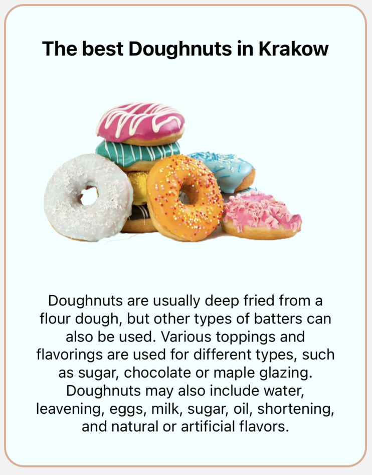
customTitle: 'The best Doughnuts in Krakow',
customDescription:
'Doughnuts are usually deep fried from a flour dough, but other types of batters can also be used. Various toppings and flavorings are used for different types, such as sugar, chocolate or maple glazing. Doughnuts may also include water, leavening, eggs, milk, sugar, oil, shortening, and natural or artificial flavors.',
},
config: {
duration: 2000,
},
})
}
/>
<CustomCaseButton
buttonTitle="Custom Info"
onPress={() =>
notify('custom_info', {
params: {
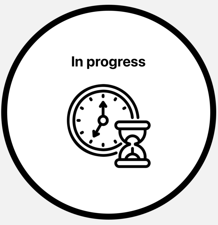
customTitle: 'In progress',
},
config: {
duration: 3000,
},
})
}
/>
</SafeAreaView>
)
}
The first step is to initialize process using createNotifications.
In the settings, we can use property variants.
This is the place where we will pass our components. Let's take a closer look at it:
const { useNotifications, NotificationsProvider } = createNotifications({
  variants: {
    advertisement: {
      component: Advertisement,
      config: {
        notificationPosition: 'top',
        duration: 5000,
      },
    },
    custom_info: {
      component: CustomInfo,
      config: {
        duration: 2000,
      },
    },
  },
  isNotch: true,
})
variants is an object with the keys, which are the names of the variants we want to create.
In this case, we want to create advertisement, and the custom info, so I decided to use those names literally.
You can name your variant whatever you like. It can be 'modal' / 'lol' / 'my_precious_variant' etc. It depends on you.
Every custom variant in also an object where we need to pass our custom component, and optionally config.
Let's recall properties that config can take:
| Name | Type | Default | Description |
|---|---|---|---|
| duration | Number | 3000 | Use this property to set how long the notifications should be displayed on the screen. Value expressed in milliseconds |
| notificationPosition | 'top' / 'center' / 'bottom' | 'top' | Set where the notifications should appear on the screen. You can choose one of three default options: top / center / bottom. To read more about the notification position please go to the NOTIFICATION POSITION section. |
| animationConfig | Object | SlideInLeftSlideOutRight | Property responsible for the notification animation. You can set one of the animations prepared by us, or make your own config. To read more about the animation settings please go to the ANIMATIONS SETTINGS section. |
Now, our custom modals are 'injected' inside the library, and we can use them, exactly in the same way as we did with default notifications (success / error / info / warning).
What is important, that when we pass the name of the notification, then instead of the success / error / info / warning we used before, now we need to pass name we declared in the variants. In my case they are the advertisement and the custom_info
It's a first argument we pass to the notify:
<CustomCaseButton
  buttonTitle="Advertisement"
  onPress={() =>
    notify('advertisement', {
      params: {
        customTitle: 'The best Doughnuts in Krakow',
        customDescription:
          'Doughnuts are usually deep fried from a flour dough, but other types of batters can also be used. Various toppings and flavorings are used for different types, such as sugar, chocolate or maple glazing. Doughnuts may also include water, leavening, eggs, milk, sugar, oil, shortening, and natural or artificial flavors.',
      },
      config: {
        duration: 2000,
      },
    })
  }
/>
<CustomCaseButton
  buttonTitle="Custom Info"
  onPress={() =>
    notify('custom_info', {
      params: {
        customTitle: 'In progress',
      },
      config: {
        duration: 3000,
      },
    })
  }
/>
After that we have params.
They are just literally the props we pass to our custom modal.
In the CustomInfo we require only customTitle, so we just need to pass this one to the params.
config is still have the 3 properties we recall above.
We can pass the config when we're 'injecting' our custom modal to the library, or when we call it. It depends on you.
Please remember that the config in the notify (when we call it) overwrites config that we declared in the 'injection' process.
Implement close button
In case you need to implement close button in your custom component, here is the code showing implementation in out 'CustomInfo' notification:
import { Image, Text, View } from 'react-native'
import { TouchableOpacity } from 'react-native-gesture-handler'
import React from 'react'
import { styles } from './styles'
import { useNotificationController } from 'react-native-notificated'

type Props = {
  customTitle: string
}

export const CustomInfo = ({ customTitle }: Props) => {
  const { remove } = useNotificationController()

  return (
    <View style={styles.info_container}>
      <Text style={styles.info_title}>{customTitle}</Text>
      <Image source={require('../../../../assets/in_progress.png')} style={styles.info_image} />
      <TouchableOpacity
        onPress={() => {
          remove()
        }}>
        <Image source={'../../../../assets/close-regularMode.png'} style={styles.icon} />
      </TouchableOpacity>
    </View>
  )
}
There are a few new things along with the previously shown code. First, we need to add two imports: a 'TouchableOpacity' from react-native-gesture-handler and 'useNotificationController' hook provided with react-native-notificated. 'useNotificationController' hook returns method 'remove' which can be applied in our custom notification. The only thing that has to be done to implement the close button is to add a close button in our return part of the component and invoke remove() on the press event.
Now let's take a look how our examples looks like:
Advertisement
Custom info