Custom Buttons
To preview app with this example, clone github repo and run yarn example ios or yarn example android.
Usage
We've introduced a custom button feature to provide you with the flexibility to add your unique functionality to our interface.
The customButtons prop allows you to inject custom buttons into the EmojiPicker component, enabling additional functionalities or actions within the emoji picker interface. This flexible prop accepts an array of React elements, allowing for multiple custom buttons to be specified.
To use the customButtons prop, pass an array of React components that you wish to render as buttons within the emoji picker. Each component must be assigned a unique key prop to help React identify which items have changed, are being added, or are removed.
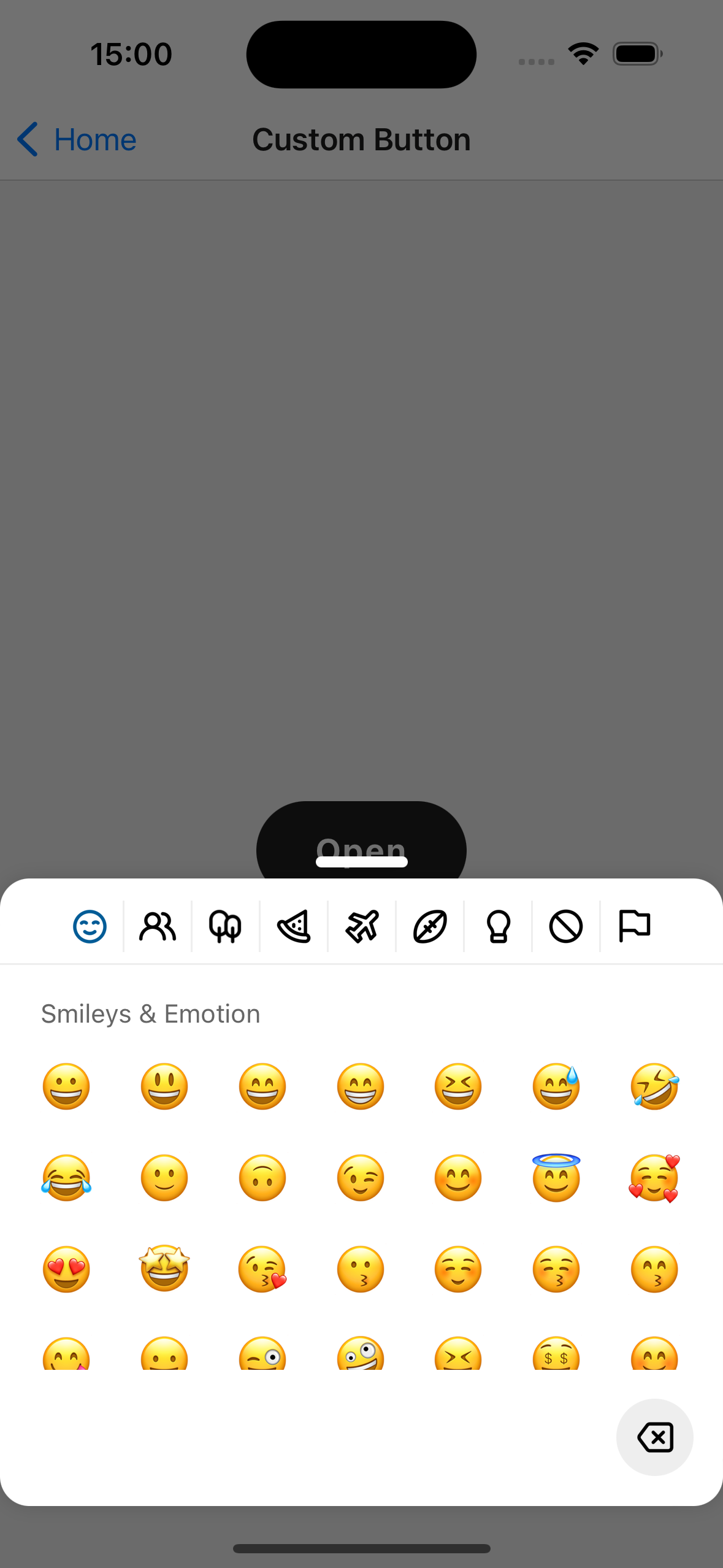
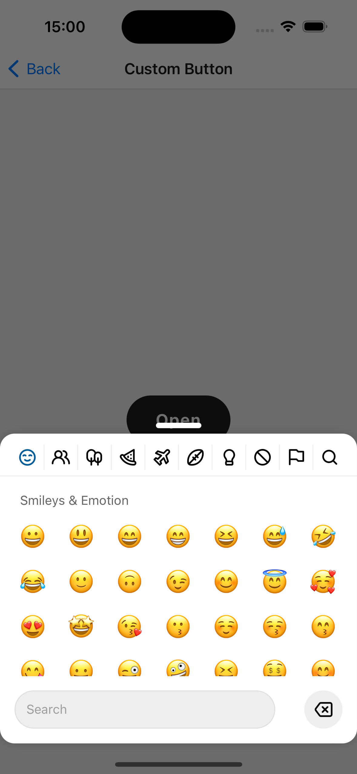
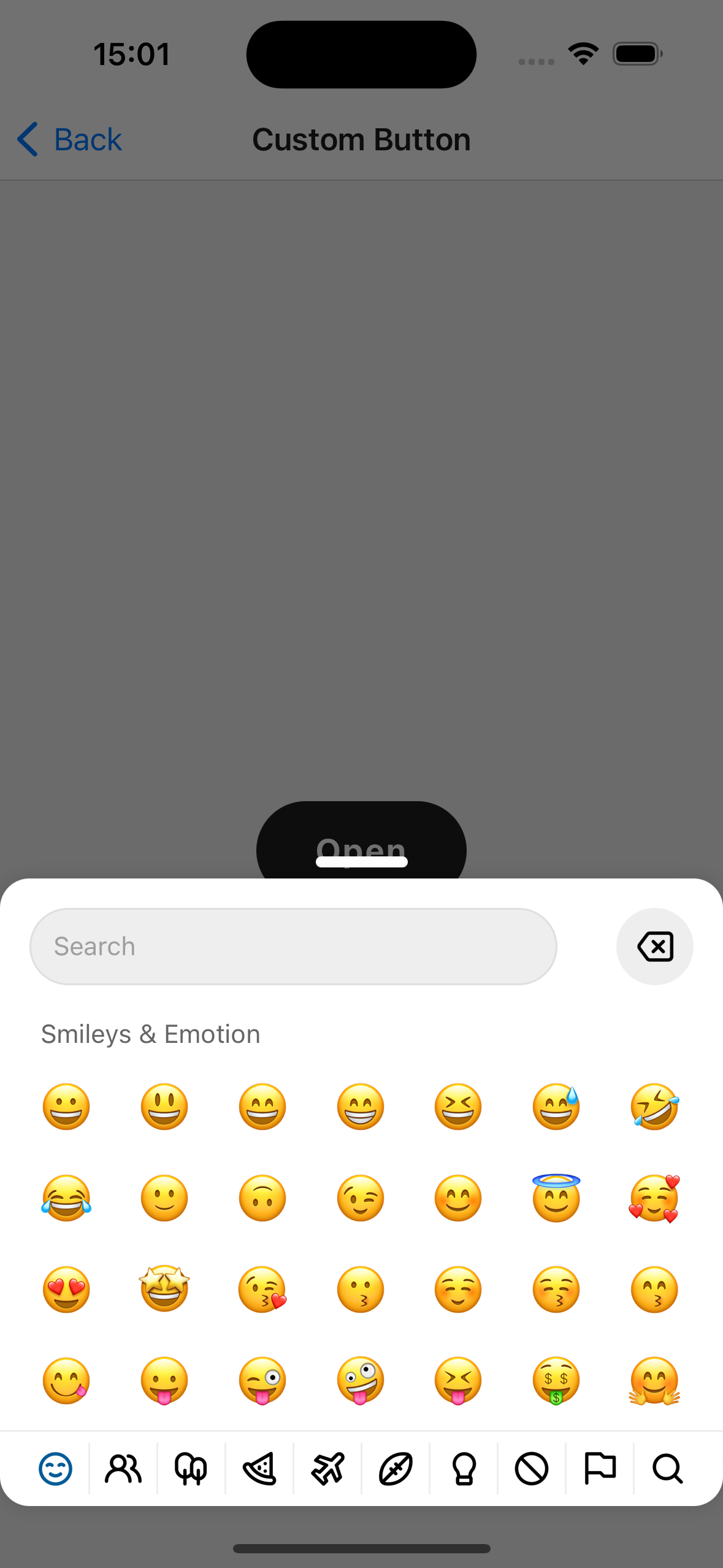
If search bar is enabled, custom buttons shows next to it.
The DeleteButton is a pre-designed component that can be used within the EmojiPicker as part of the customButtons prop array. You can add onPress prop with a function that will be called when the DeleteButton is pressed. This allows you to define the specific action that should occur on press, such as deleting an emoji from the input field.
. You can add any pressableProps you need to this custom component.
import EmojiPicker from 'rn-emoji-keyboard'

const ExampleComponent = () => {
  // ...

  return (
    <EmojiPicker
      onEmojiSelected={handlePick}
      open={isModalOpen}
      onClose={() => setIsModalOpen(false)}
      enableSearchBar
      customButtons={[
        <DeleteButton
          key="deleteButton"
          onPress={deleteLastEmoji}
          style={({ pressed }) => ({
            backgroundColor: pressed ? '#000' : '#e1e1e1',
            padding: 10,
            borderRadius: 100,
          })}
          iconNormalColor="#000"
          iconActiveColor="#fff"
        />,
      ]}
      allowMultipleSelections
      categoryPosition="top"
    />
  )
}