🖼️ Default Variants
At the start, you receive from us default styling, for all 4 types of notifications (success / error / warning / info).
If you just trigger the notification, like in the example below (we trigger the error here, but of course, it can be any other notification):
import React from 'react'
import { SafeAreaView, Text } from 'react-native'
import { createNotifications } from 'react-native-notificated'
import { styles } from './styles'

const { useNotifications, NotificationsProvider } = createNotifications()

export const GlobalConfigExamples = () => {
  const { notify } = useNotifications()

  return (
    <SafeAreaView style={styles.container}>
      <NotificationsProvider />
      <Text
        onPress={() =>
          notify('error', {
            params: {
              description: 'This is where the toast text goes. ',
              title: 'Error',
            },
          })
        }>
        Emit error
      </Text>
    </SafeAreaView>
  )
}
You will get the basic styling with the borderType set for the 'border' value, the darkMode set to false, and the defaultIconType for the color value.
(TO CHECK borderType AND OTHER STYLE PROPS GO TO THE GLOBAL STYLES SETTINGS OR SINGLE NOTIFICATION CONFIG).
Below you will find the default styling for all notification types with darkMode set to false and true for all variants.
| NotificationType | darkMode | Visualisation |
|---|---|---|
| Success | false |  |
| Success | true |  |
| Error | false | 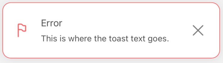 |
| Error | true | 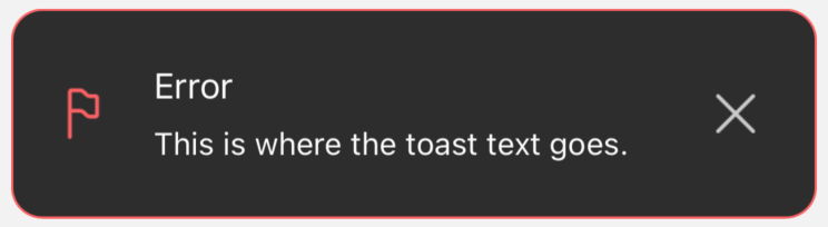 |
| Warning | false | 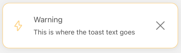 |
| Warning | true | 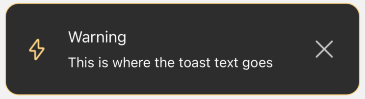 |
| Info | false | 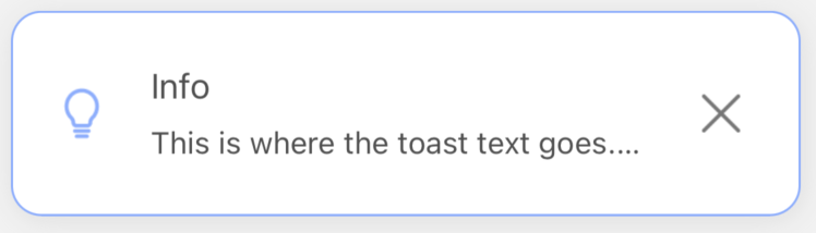 |
| Info | true | 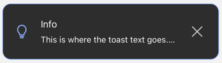 |