🔏 Default examples
We prepared a lot of examples to help you understand how we can use our library.
First, let's focus on the most basic examples. It takes very little effort to make them work.
A few lines below, you will find all the code with explanations.
Let's go then!
How to use the notify()
import React, { useState } from 'react'
import { SafeAreaView } from 'react-native'
import { createNotifications, useNotificationController } from 'react-native-notificated'
import { SuccessButton } from '../components/basicExamples/SuccessButton'
import { ErrorButton } from '../components/basicExamples/ErrorButton'
import { WarningButton } from '../components/basicExamples/WarningButton'
import { InfoButton } from '../components/basicExamples/InfoButton'
import { ModifyButton } from '../components/basicExamples/ModifyButton'
import { RemoveButton } from '../components/basicExamples/RemoveButton'
import { styles } from './styles'
const { useNotifications, NotificationsProvider } = createNotifications({
isNotch: true,
})
export const DefaultExamples = () => {
const [id, setId] = useState('')
const { notify } = useNotifications()
const { remove, modify } = useNotificationController()
return (
<SafeAreaView style={styles.container}>
<NotificationsProvider />
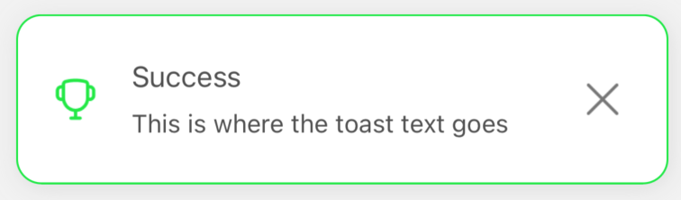
<SuccessButton
onPress={() =>
setId(
notify('success', {
params: {
description: 'This is where the toast text goes',
title: 'Success',
},
}).id
)
}
/>
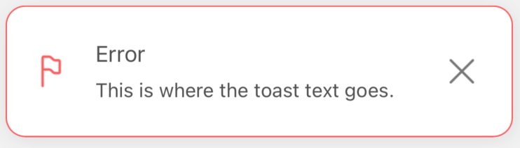
<ErrorButton
onPress={() =>
notify('error', {
params: {
description: 'This is where the toast text goes. ',
title: 'Error',
},
})
}
/>
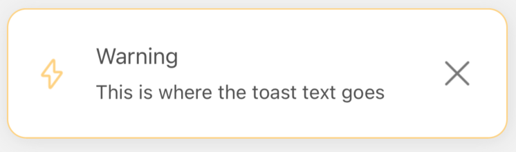
<WarningButton
onPress={() =>
notify('warning', {
params: {
description: 'This is where the toast text goes',
title: 'Warning',
},
config: {
notificationPosition: 'center',
},
})
}
/>
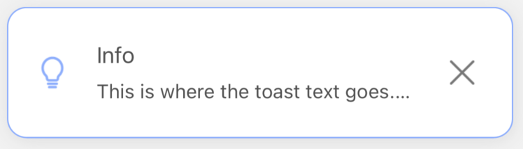
<InfoButton
onPress={() =>
notify('info', {
params: {
description: 'This is where the toast text goes.',
title: 'Info',
},
})
}
/>
<ModifyButton
onPress={() =>
modify(id, {
params: {
params: { id: id, title: 'Modified title', description: 'Modified description' },
},
})
}
/>
<RemoveButton onPress={() => remove(id)} />
</SafeAreaView>
)
}
At first, we need to import everything that is necessary for our component:
ReactanduseState- we will explain below why we needuseStatein this exampleSafeAreaViewcreateNotifications- to set the basic config and pull out ournotify()functionuseNotificationController- to pull outremove()andmodify()functions (we will explain them below)SuccessButtonand other buttons - are just styledTextcomponents which imitates our buttons:import React, { VFC } from 'react'
import { Text } from 'react-native'
import { styles } from '../styles'
type Props = {
onPress: () => void
}
export const SuccessButton: VFC<Props> = ({ onPress }) => {
return (
<Text style={[styles.text, styles.success]} onPress={onPress}>
Emit success
</Text>
)
}
When the imports are applied, we initiate createNotifications and pick useNotifications and NotificationsProvider from the box.
useNotifications- allows us to get access to thenotify()functionNotificationsProvider- it's a wrapper, like all others providers (ContextProvider, ApolloProvider etc.). This one is necessary to allow the library to operate within the prescribed scope. What is special here is that we don't need to wrap the scope in it. We can just put it as a self-closing component, and everything that is nested in the same wrapper as our provider will get access to our notifications.
Inside our DefaultExamples component we initiate state which will hold the notification ID for us.
Last thing, we need to do is to unpack notify(), remove() and modify() methods.
Those methods are crucial because:
notify()- initiate every single notification. In the examples, we trigger it byonPress, but of course, it can be called in every other context you need, for example, after data fetching or after successful sign-in.remove()- externally remove triggered notification (it's not required, in the basic usage, but worth knowing)modify()- modify triggered notification (it's not required, in the basic usage, but worth knowing)
If you need more info on how those methods works please check the BASIC USAGE section.
As we said above, we trigger every notification by pressing the button. All we need to pass to the onPress event is:
() => notify('error', {
                params: {
                    description: 'This is where the toast text goes. ',
                    title: 'Error',
                },
            })
First argument is a notification type (success/error/info/warning) and the second is an object with settings, consisting of the two parts: params and config (check Single Notification Config).
Only description props is required, but usually, it's good to have also a title. >br/>
Our notification has been set, and it looks like that:
TADAM! Magic happens!! 🤗
How to use the error() and the modify()
This is a little more complicated, but just a little (I promise!)
All we need to do is to get chosen notification ID and set it in our state.
As you can see in the code below:
() =>
  setId(
    notify('success', {
      params: {
        description: 'This is where the toast text goes',
        title: 'Success',
      },
      config: {
        notificationPosition: 'center',
      },
    }).id
  )
We just wrapped notify() in our setId setter, and pulled id from the object returned by notify().
Now it's time to:
Pass the id to the modify() method:
    <ModifyButton
        onPress={() =>
          modify(id, {
            params: {
              params: { id: id, title: 'Modified title', description: 'Modified description' },
            },
          })
        }
    />
and add new settings which will overwrite those previously set in the notification (the only extra value is the id in the params object).
In other words, we can easily change any notification to a completely different one.
In the example above we changed only the title and the description, but we literally can change any value described in the Single Notification Config section.
Pass the id to the remove() method:
<RemoveButton onPress={() => remove(id)} />
and... that's all...
We can simply call remove() method and pass id of the notification that should be manually and externally removed.
Why externally? Because internally (inside the notification), we have the close X icon.
It’s simply a CLOSE BUTTON (let’s call it that) which you can use outside the notification.
Visualization of examples
Let's see the notifications we declared above:
Success notification
Error notification
Warning notification
Info notification
Modify notification
Before
And after
Remove notification
Before
And after ;)
