🧭 Custom examples
Code has been already described step by step in the DEFAULT EXAMPLES section, so I think there is no use to do it here again.
Here we have only a few differences I need to mention, and they are minimal:
- we use
modify()andremove()only in the DEFAULT EXAMPLES because their usage is limited, and the explanation there is all we need to know. We can remove the notification, or modify it, and therefore we will not be using them here and in the other examples as well. For that same reason, we will not be usinguseStateanduseNotificationControllerhere. - we filled the
styleobject in every notification. To read more about the single notification properties please go to the SINGLE NOTIFICATION CONFIG section.
In fact that's the only differences between Default Examples and Custom Examples.
Let's take a look at the code and the visualisations then:
Code
import React from 'react'
import { SafeAreaView } from 'react-native'
import { styles } from './styles'
import { createNotifications } from 'react-native-notificated'
import { SuccessButton } from '../components/basicExamples/SuccessButton'
import { ErrorButton } from '../components/basicExamples/ErrorButton'
import { WarningButton } from '../components/basicExamples/WarningButton'
import { InfoButton } from '../components/basicExamples/InfoButton'
const { useNotifications, NotificationsProvider } = createNotifications({
isNotch: true,
})
export const SingleCustomCases = () => {
const { notify } = useNotifications()
return (
<SafeAreaView style={styles.container}>
<NotificationsProvider />
<SuccessButton
onPress={() =>
notify('success', {
params: {
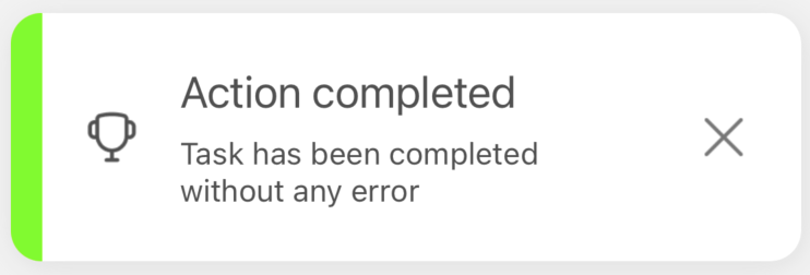
description: 'Task has been completed without any error ',
title: 'Action completed',
style: {
titleSize: 20,
descriptionSize: 14,
accentColor: '#7CFC00',
borderType: 'accent',
defaultIconType: 'monochromatic',
multiline: 2,
},
},
})
}
/>
<ErrorButton
onPress={() =>
notify('error', {
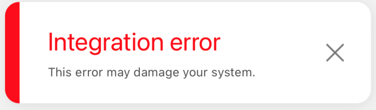
params: {
description: 'This error may damage your system. ',
title: 'Integration error',
style: {
titleSize: 25,
titleColor: '#FF0000',
descriptionSize: 12,
accentColor: '#FF0000',
borderType: 'accent',
defaultIconType: 'no-icon',
},
},
})
}
/>
<WarningButton
onPress={() =>
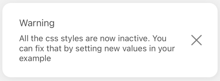
notify('warning', {
params: {
description:
'All the css styles are now inactive. You can fix that by setting new values in your example',
title: 'Warning',
style: {
defaultIconType: 'no-icon',
borderType: 'no-border',
multiline: 3,
},
},
})
}
/>
<InfoButton
onPress={() =>
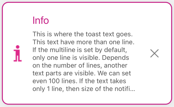
notify('info', {
params: {
description:
'This is where the toast text goes. This text have more than one line. If the multiline is set by default, only one line is visible. Depends on the number of lines, another text parts are visible. We can set even 100 lines. If the text takes only 1 line, then size of the notification will fit',
title: 'Info',
style: {
titleSize: 22,
titleColor: '#C71585',
leftIconSource: require('../../assets/custom-info-icon-2.png'),
multiline: 8,
accentColor: '#C71585',
borderWidth: 2,
},
},
})
}
/>
</SafeAreaView>
)
}
Visualization of examples
Let's see the notifications we declared above:
Success notification
Error notification
Warning notification
Info notification
Conclusion
Like we can see, every notification has its own style, but it doesn’t go beyond the scope of this individual notification
What we should remember is that the single notification style overwrites each of those configs:
globalConfigsuccessConfigerrorConfigwarningConfiginfoConfig
To read more please go to SINGLE NOTIFICATION CONFIG and the ORDER OF SETTINGS OVERWRITING sections.