📬 Single Notification Config
Besides global settings, you can also pass props to the notification instance.
PROPS description IS REQUIRED.
There are two main props you can pass to the notification:
- params
- config
    <Text
        onPress={() =>
          notify('error', {
            params: {},
            config: {},
          },
        )}
    >
Let's take a look at the params object properties:
| Name | Type | Default | Description |
|---|---|---|---|
| title | String | '' | Props you can use to pass the notification title. Most of the notifications have the title, but this is not required. |
| description | String | '' | Props you can use to pass the notification description. This props is required! |
| onPress | Function | - | The onPress props gives you possibility to pass extra function, which will be invoked when you use 'X' to close the notification |
| style | Object | - | Object with the style properties. You can pass here style settings which will be applied only to this notification instance. Style properties passed here overwrites style settings from defaultStylesSettings. |
    <Text
        onPress={() =>
          notify('error', {
            params: {
              title: '',
              description: '',
              onPress: () => {},
              style: {},
            },
            config: {},
          },
        )}
    >
And in the config object:
| Name | Type | Default | Description |
|---|---|---|---|
| duration | Number | 3000 | Use this property to set how long the notifications should be displayed on the screen. Value expressed in milliseconds |
| notificationPosition | 'top' / 'center' / 'bottom' | 'top' | Set where the notifications should appear on the screen. You can choose one of three default options: top / center / bottom. To read more about the notification position please go to the NOTIFICATION POSITION section. |
| animationConfig | Object | SlideInLeftSlideOutRight | Property responsible for the notification animation. You can set one of the animations prepared by us, or make your own config. To read more about the animation settings please go to the ANIMATIONS SETTINGS section. |
| onClose | Function | - | The onClose config option gives you possibility to pass an extra function, which will be invoked upon dismissal of the notification (triggered by swipe gesture, remove method - e.g. close button in default variants or when notification disappears) |
| gestureConfig | Object | iOS: 'y' / android: 'x' | Object responsible for setting gesture direction that triggers swipe-dismiss of notification. |
    <Text
        onPress={() =>
          notify('error', {
            params: {},
            config: {
              duration: 100,
              notificationPosition: 'top',
              animationConfig: {},
              onClose: () => {},
              gestureConfig: { direction: 'y' }
            },
          },
        )}
    >
Gesture config
The library gives the possibility to swipe-dismiss the notication so users don't rely only on pressing close button or duration timeout.
There are 3 types of gesture config: none, one-dimensional and two-dimensional. By choosing none, we switch off the possibility to swipe-dismiss a notification.
We can pass gestureConfig to config object like so:
gestureConfig: {
  direction: 'y' | 'x' | 'full' | 'none'
}
Default value for iOS: 'y'
Default value for Android: 'x'
By choosing full direction, we allow notifications to be dismissed in both directions. In this case, some additional config is required, like so:
  gestureConfig: {
    direction: 'full',
    x: { activationDistances: 50, activationVelocities: 200 },
    y: { activationDistances: 50, activationVelocities: 200 },
  },
✨ Style props
As we said above, in the style we can pass style settings for the notification instance.
In fact style props have the same properties as the globalConfig, successConfig, errorConfig, warningConfig, infoConfig.
Check the GLOBAL STYLES SETTINGS
| Name | Type | Default | Description |
|---|---|---|---|
| titleSize | Number | 16 | Set font size for the notification title |
| titleColor | String | '#505050' (darkMode - false) / '#FAFAFA' (darkMode - true) | Set font color for the notification title |
| descriptionSize | Number | 14 | Set font size for the notification description |
| descriptionColor | String | '#505050' (darkMode - false) / '#FAFAFA' (darkMode - true) | Set font color for the notification description |
| bgColor | String | '#FFFFFF' (darkMode - false) / '#2D2D2D' (darkMode - true) | Set background color for the notification |
| borderType | 'border' / 'accent' / 'no-border' | 'border' | Set type of border for the notification (EXAMPLES) |
| accentColor | String | '#00EA33' (success type) / '#FC6060' (error type) / '#8CACFF' (warning type) / '#FFD37D' (info type) | Set accent color for the notification. The color of the border or the left side accent line |
| borderRadius | Number | 14 | Set border radius for the notification container |
| borderWidth | Number | 1 | Set border width for the notification container |
| multiline | Number | 1 | Set number of visible lines for the notification description |
| defaultIconType | 'color' / 'monochromatic' / 'no-icon' | 'color' | This props works only with default icons. If you set your own icon it has no effect. (EXAMPLES) |
| leftIconSource | ImageSourcePropType | - | Set custom left icon for the notification (in png). For example. require(../assets/icon.png) |
What is important here is that the style props overwrite the styles passed in defaultStylesSettings.
To understand it perfectly, let's take a look at the few examples below.
🖌️ Style overwriting example
import React from 'react'
import { SafeAreaView, Text } from 'react-native'
import { createNotifications } from 'react-native-notificated'
import { styles } from './styles'

const { useNotifications, NotificationsProvider } = createNotifications({
  defaultStylesSettings: {
    globalConfig: {
      titleSize: 20,
      titleColor: '#4B0082',
      descriptionSize: 12,
      descriptionColor: '#B0E0E6',
      bgColor: '#FFFFF0',
      borderRadius: 25,
      accentColor: '#4B0082',
      borderWidth: 3,
      multiline: 5,
    },
    errorConfig: {
      descriptionSize: 12,
      descriptionColor: '#4B0082',
      accentColor: '#B0E0E6',
      borderWidth: 2,
      multiline: 10,
    },
  },
})

export const GlobalConfigExamples = () => {
  const { notify } = useNotifications()

  return (
    <SafeAreaView style={styles.container}>
      <NotificationsProvider />
      <Text
        onPress={() =>
          notify('error', {
            params: {
              description: 'This is where the toast text goes. ',
              title: 'Error',
              style: {
                borderRadius: 15,
                borderWidth: 1,
              },
            },
          })
        }>
        Emit error
      </Text>
    </SafeAreaView>
  )
}
In the beginning, we overwrote globalConfig in the default settings:
- titleSize
- titleColor
- descriptionSize
- descriptionColor
- bgColor
- borderRadius
- accentColor
- borderWidth
- multiline
In the errorConfig we have overwritten:
- descriptionSize
- descriptionColor
- accentColor
- borderWidth
- multiline
And in style we have overwritten:
- borderRadius
- accentColor
- borderWidth
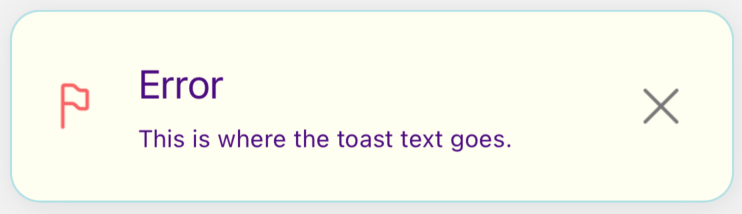
So the final style setting for this error notification is:
{
    titleSize: 20,
    titleColor: '#4B0082',
    descriptionSize: 12,
    descriptionColor: '#4B0082',
    bgColor: '#FFFFF0',
    borderRadius: 15,
    borderWidth: 1,
    accentColor: '#B0E0E6',
    multiline: 10
}
Remember that title, description and onPress are not the styling props.
And the final effect:
So in conclusion -
styleobject overwritessuccessConfig/errorConfig/warningConfig/infoConfig(depends on which notification type are you using and styling),globalConfig, and DEFAULT SETTINGSsuccessConfig/errorConfig/warningConfig/infoConfigoverwritesglobalConfig, and DEFAULT SETTINGSglobalConfigoverwrites DEFAULT SETTINGS