🖋️ Global types config examples
Code has been already described step by step in the DEFAULT EXAMPLES section, so I think there is no use to do it here again.
Here we have only a few differences I need to mention, and they are minimal:
- we use
modify()andremove()only in the DEFAULT EXAMPLES because their usage is limited, and the explanation there is all we need to know. We can remove the notification, or modify it, and therefore we will not be using them here and in the other examples as well. For that same reason, we will not be usinguseStateanduseNotificationControllerhere. - we filled the
successConfig,errorConfig,warningConfigand theinfoConfigobjects in thedefaultStylesSettings. Those objects are responsible for setting properties for all notifications in the given type. To read more please go back to the GLOBAL CONFIG section.
That's the only difference between Default Examples and Global Types Config Examples.
Let's take a look at the code and the visualizations then:
Code
import React from 'react'
import { SafeAreaView } from 'react-native'
import { createNotifications } from 'react-native-notificated'
import { SuccessButton } from '../components/basicExamples/SuccessButton'
import { ErrorButton } from '../components/basicExamples/ErrorButton'
import { WarningButton } from '../components/basicExamples/WarningButton'
import { InfoButton } from '../components/basicExamples/InfoButton'
import { styles } from './styles'
const { useNotifications, NotificationsProvider } = createNotifications({
isNotch: true,
defaultStylesSettings: {
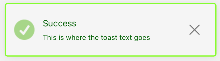
successConfig: {
leftIconSource: require('../../assets/custom-success-icon.png'),
titleSize: 15,
titleColor: '#006400',
descriptionSize: 12,
descriptionColor: '#006400',
bgColor: '#F5F5F5',
borderRadius: 5,
accentColor: '#7FFF00',
borderWidth: 2,
},
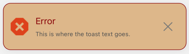
errorConfig: {
leftIconSource: require('../../assets/custom-error-icon.png'),
titleSize: 18,
titleColor: '#8B0000',
descriptionSize: 12,
bgColor: '#DEB887',
borderRadius: 15,
accentColor: '#8B0000',
},
warningConfig: {
leftIconSource: require('../../assets/custom-warning-icon.png'),
titleSize: 20,
titleColor: '#fff',
descriptionSize: 14,
descriptionColor: '#fff',
bgColor: '#191970',
borderRadius: 10,
accentColor: '#FF8C00',
borderWidth: 3,
multiline: 3,
},
infoConfig: {
leftIconSource: require('../../assets/custom-info-icon.png'),
titleSize: 20,
titleColor: '#1E90FF',
descriptionSize: 14,
descriptionColor: '#1E90FF',
borderWidth: 0,
multiline: 4,
},
},
})
export const GlobalTypesConfigExamples = () => {
const { notify } = useNotifications()
return (
<SafeAreaView style={styles.container}>
<NotificationsProvider />
<SuccessButton
onPress={() =>
notify('success', {
params: {
description: 'This is where the toast text goes',
title: 'Success',
},
})
}
/>
<ErrorButton
onPress={() =>
notify('error', {
params: {
description: 'This is where the toast text goes. ',
title: 'Error',
},
})
}
/>
<WarningButton
onPress={() =>
notify('warning', {
params: {
description: 'This is where the toast text goes',
title: 'Warning',
},
})
}
/>
<InfoButton
onPress={() =>
notify('info', {
params: {
description: 'This is where the toast text goes.',
title: 'Info',
},
})
}
/>
</SafeAreaView>
)
}
Visualization of examples
Let's see the notifications we declared above:
Success notification
Error notification
Warning notification

Info notification

Conclusion
All notifications of the same type will have the same style properties.
Importantly, the successConfig, errorConfig, warningConfig and the infoConfig overwrites the globalConfig setting, but only for its own types.
To find out more, go back to the GLOBAL CONFIG
and the ORDER OF SETTINGS OVERWRITING sections.